Heat Level:  Mild: These tips are beginner-friendly.
Bottom Line: As the web has become more mature, there are now more researched, proven guidelines that make for a successful website (especially in Real Estate).
Do This: Review your site (either on your own or with your website manager) to make sure you have these most-important areas covered… and leave out anything that hurts user-experience.
 Clean and simple - that's the key to modern design. You need to have a website. That’s old news. You know that by now.
Beyond the awareness that you need a website, you might not have really thought about why, about what you want it to do. What goals do you have for your website? It can serve as a digital brochure, a digital brand awareness pamphlet, but ultimately it is there to generate revenue for the value your service or product provides. Since the web has become more mature, there are now more researched, proven guidelines that make for a successful website.
Whether you’re a broker or agent, these design and tech best-practices are a blueprint to making your real estate website more effective. Give the people what they want - clear information and a good user experience - and they’ll reward you with more business.
NAR’s 2017 data shows that 95% of all homebuyers used the internet in their home search. Even as web developers, that stat blew our minds! We can only imagine that number is on the rise in 2019. Including listings via IDX on your own website means three things:
51% of people think "thorough contact information" is the most important element missing from many company websites. As a potential customer with questions, you want your visitors to be able to contact you if they have questions or seek your services. Skim your site and make sure this info hasn’t slipped through the cracks:
Many older websites just assumed that the user knew what to do next. Sometimes it takes a little more urging to get users to take another step. Calls to action help lead the visitor along the path you intend them to take. Your mission is to get them in touch with you in as few clicks as possible.
Many real estate CTAs take the form of a contact form, or a button that leads the user to a form. Browse your own site and make sure you have relevant, helpful CTAs (calls to action) throughout:
The best modern contact forms have as few fields as necessary. Often the only info you need to reel in a lead are a name and phone number or email address. We often require a “message” field so that there’s a little more to go off of. This also helps cut down on junk leads (if they can’t be bothered to write a message, are they really going to buy/sell a house?)
Many real estate websites include a Free CMA form. These can get really lengthy if you ask for all the details about the property (age, construction type, flooring, garage type, etc.) Most users will get intimidated by this giant form and leave, even if the fields aren’t required. Instead, ask only what you need - you can get everything you need for a CMA with just an address, right?
Website users often use social media as a third-party reliability check. They know you have full control over that appears on your website, and your polished image might not be the full story. They’ll pop over to Facebook and check your reviews, follower counts, and general interactions to make sure you’re legitimate.
Visitors may also choose to follow you on social media to see your amazing content, or to contact you via Facebook Messenger. Whatever their motivation, make sure you have your social media links in the footer of your site so people can find you. You can also include social in your header and Contact page, as long as your phone number and/or business address takes first priority.
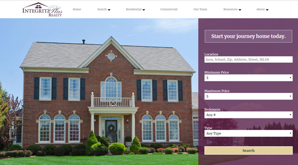
Ok, this is the biggest area to flesh out. Design trends and best-practices have evolved so much since the cluttered, flashy days of the early web. But here’s the biggest takeaway: make it clean, spacious, and uncluttered. (Actually, isn’t that what most people want in a new home, too?)
Of course all of this is easier said than done. Try to get as many of these best-practices rolled into your site. At the very least, make sure you’re avoiding these design deadly sins...
The 2006 version of our ListingManager website is actually a good case-study for what will not fly in 2019!
Nothing says “I haven’t updated my website since 2004” like using Flash. Many people don’t use Flash anymore, so when they come to your website, they just see a big grey “click to enable (or download Flash.” In addition to looking dated, Adobe has stated it will officially end support for the ailing web plugin in 2020. Remove any Flash features and update to HTML5 animations and interactive elements.
A top-bar, horizontal navigation is the design standard. If your website has a left-sidebar navigation, your users might find that the links are too small and close together. It’s also nearly impossible to categorize and organize your links like this. Using standard horizontal navigation on your site will allow visitors to more quickly and easily know how to use your site. So go with a nicely-organized top navigation with dropdowns and a hamburger mobile menu.
Users find it annoying when videos and music start playing automatically. There’s no good reason to have video or audio start without the user’s consent, so leave it off. The only exception would be the trend of background hero videos, which should be subtle and soundless.
(Fun fact: we once had a client ask us to have a very-explicit rap song play when people visited their website. We declined that request.)
Live chat is a good feature, generally. In fact, J.D. Power found that 42% of customers prefer live chat (compared to just 23% for email). What they don’t prefer, though, are when they pop up and won’t go away, obscuring the screen. Or, when they say, “No one is online right now.” Think carefully about whether a live chat enhances or detracts from user experience on your website.
Images can capture attention, communicate quickly, and compel your audience. They shouldn’t be on your site just to take up space or merely serve as decoration. Images should be used to support your content, and be expressive of the personality of your business.
If you primarily work in the city, users might get confused by beach or mountain photography.
Time flies, technologies change, and best practices are always on the move. If your site isn’t up to par with the design specs listed above, consider an upgrade. It’s the best way to put your best foot forward online.
